
Behind the Scenes: How We Work With Color In Our Letterpress Studio

Every year on the first Saturday in May, printmakers all over the world make prints and share with one another about their process. I love this opportunity to see what other artists are making and getting to see all the wild variety within the medium of printmaking.
In honor of this year's celebration, we are offering a glimpse behind the scenes at how we work with color in our relief printmaking studio.
Freedom in Limits
The most defining principle in our use of color at Heartell is our limited palettes. This feature is born of necessity: every color on one of our letterpress cards means another woodblock to carve and another pass through the press to print it. 

The other feature of block printing that influences how our designs look is that there aren’t any gradations of each color within each design: the ink is either there or not there when the block hits the paper so there are no “gray areas” so to speak. Any variations in value apply to the whole block: we can decide to print a layer with more ink or less, but it can’t be darker on one side of the block and lighter on the other. I achieve different values using texture and layering of one color over another.

I don’t really see these aspects of relief printing as a hindrance; they are part of what drew me to this medium in the first place. I think having to refine and focus my ideas in order to make them work in relief gives the end product a clarity that fits with the simple, sincere messages our cards are meant to convey.
Designing with constraints is so much easier than having endless choices, and limiting the colors helps to unify each collection and our catalog as a whole. Each collection is a puzzle and it is fun to try and figure out how to make a few colors work for a variety of different images.
To Layer or Not
Our early designs just had one or two colors, a rare third one. This was also out of necessity since I was printing all our cards on a small tabletop Pilot press.

In addition to being a lot of physical work to use, the Pilot leaves a thick layer of ink on the paper, so it can be hard to get them all the way dry (it didn’t help that I was using rubber-based ink, not the best choice but I didn’t know that back then!). I’ve only ever had one complaint in my nine years of selling greeting cards about the quality of our products and it happened during this time, when the ink wasn’t all the way dry on a batch of three-color cards and the ink was sticking to the plastic sleeves we shipped them in. Cringe! We live and learn.
Now that we have a big floor-model platen press, and two wonderful printers who are more skilled than I am technically to run it, we can experiment with layering more. I love designing this way and some of our most popular designs have layered color on them.

Mixing Colors
In the beginning I mixed all my inks by hand. As Heartell grew and I started hiring printers to help me with production, we realized we were spending too much time trying to get the right color matches.
 We started working with an expert named Jim Kuhlenberg over at Kennedy Ink, a wonderful company in Cincinnati, to have custom inks mixed for us. We sent him samples of cards we’d printed using my mixes and a big stack of the paper we like to print on and he worked hard to create formulas to be able to recreate our colors. It’s tricky because even our big letterpress lays down a much thicker layer of ink than an offset or digital press would, so he spent some time understanding how much pigment to add in order to get the saturation levels right.
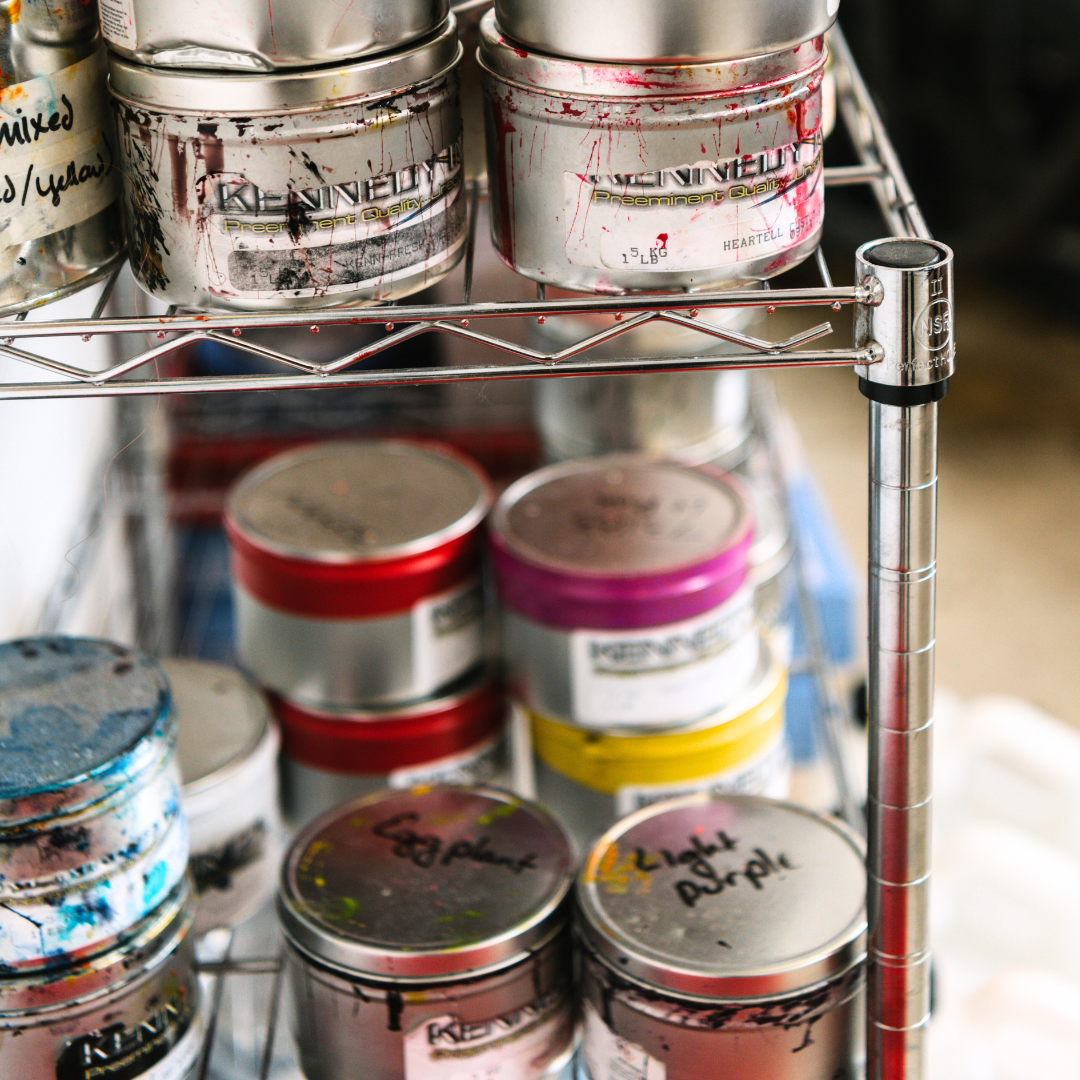
When Jim sends us a new ink, he sends swatches with it called drawdowns (because you take a palette knife and draw the ink down over a piece of paper to make a smooth stripe) and I keep them hanging on hooks in my office so I can reference them. Now when we add a new color, we use the Pantone Matching System (PMS) to communicate with Jim about what we want. This makes it much easier to move between digital and analog spheres. I keep all of our colors organized in my CC library so that I can use them in all the Adobe design programs and in Canva.
![]()
We also keep them organized in a database in Airtable, with the PMS number, the Kennedy formula number, Hex codes and our own internal names for each color (Forest, Sage, Lime, Piss Yellow [we have some friendly internal disagreement about what some of these names should be]). We have those linked to records of all our designs (we have over 300 card designs in our catalog at this point!) and which colors we need to print each one. How we use digital tools is a whole other post that I am working on for another time! Having everything integrated with the PMS system has also been very helpful for designing the kitchen towels and sponge cloths we recently added to our assortment. I decided early on I wanted to use colored fabrics for these products (white ones always end up looking stained and dirty too quickly in my house!) and I set myself the challenge of having the color of the fabric be the focus of each design (so the lemons are the yellow of the towel, the tomatoes are the red of the towel etc.).

Using PMS colors for the screenprinting inks helped us communicate with our manufacturing partners and keep everything looking coordinated with the letterpress designs we made to go along with the towels and cloths.

It was fun to work in the tone-on-tone palette we settled on for this release. We also experimented with printing on colored paper for the first time, on beautiful recycled papers from French Paper in Michigan. That has turned out to be hard to maintain from an inventory/supply standpoint, but it was fun to try.

Metallics
In the last couple of years we’ve experimented with metallic inks. We used gold in the collection we released in early 2020.

We used silver in our 2022 offset printed collection. We also used a special black ink made using algae in that collection, you can read more about that here.

Oil-based metallic inks in letterpress aren’t really shiny (foil is how you achieve that - something I want to try in the future!). Their main characteristic is that they are much more opaque, so we have to be careful about what order we print colors in if gold or silver are in the mix. But they do add another dimension to a design and it has been fun to incorporate those elements.
Neon
Last fall we released our first risograph prints for our Art for Change collection. Riso is similar to letterpress in that each color requires a separate drum of ink and a separate pass through the press. I loved working on that project, especially getting to use neon for the first time. You can read more about that project here.

I loved the neon so much we had Jim mix up a neon for us to run on our letterpress.

We used our new neon pink in the palette for our Wedding/Anniversary collection of cards and prints that we released in January. It is especially fun to layer because it lends a richness to the darker values that result.

I hope this has been fun to read! Please comment below if there are other things you’d like to learn about our process, I’d love to hear from you.